
Addington
Classical character. A contemporary rhythm. An editorial exploration that lets typography tell the story.
Project type
Concept project
Industry
Editorial Design
Services
Art Direction · Typography · Booklet Design
Overview
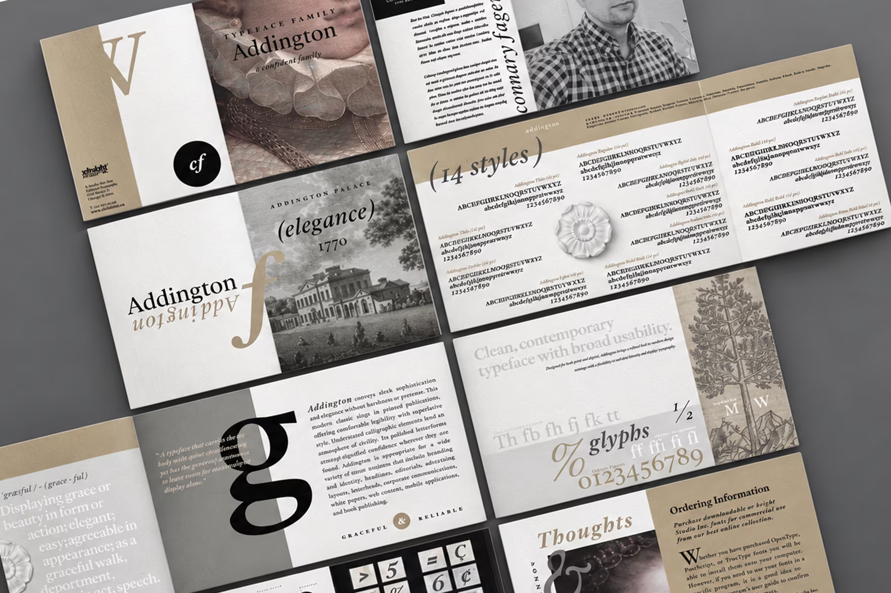
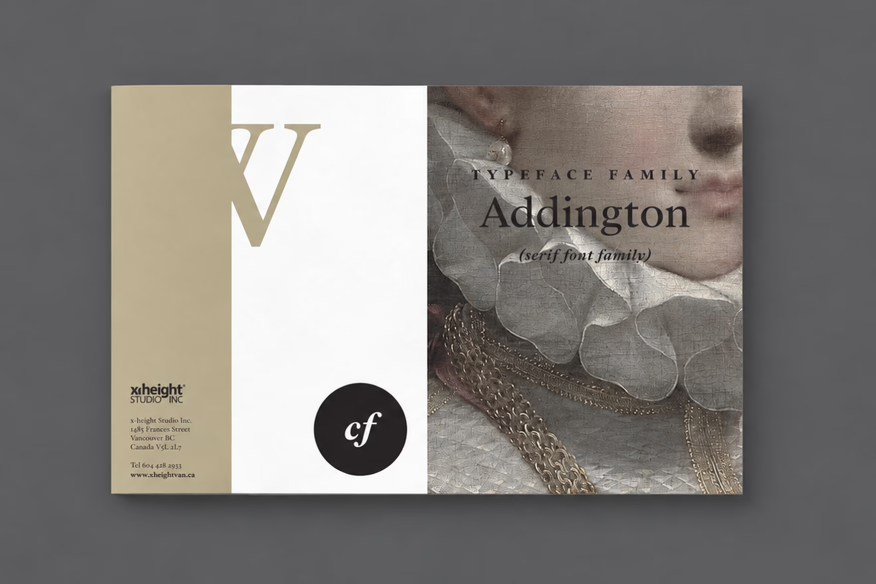
This concept booklet explores the Addington typeface family through the lens of editorial design. The aim: to bring its classical character into a contemporary composition, with refinement and legibility at the centre.
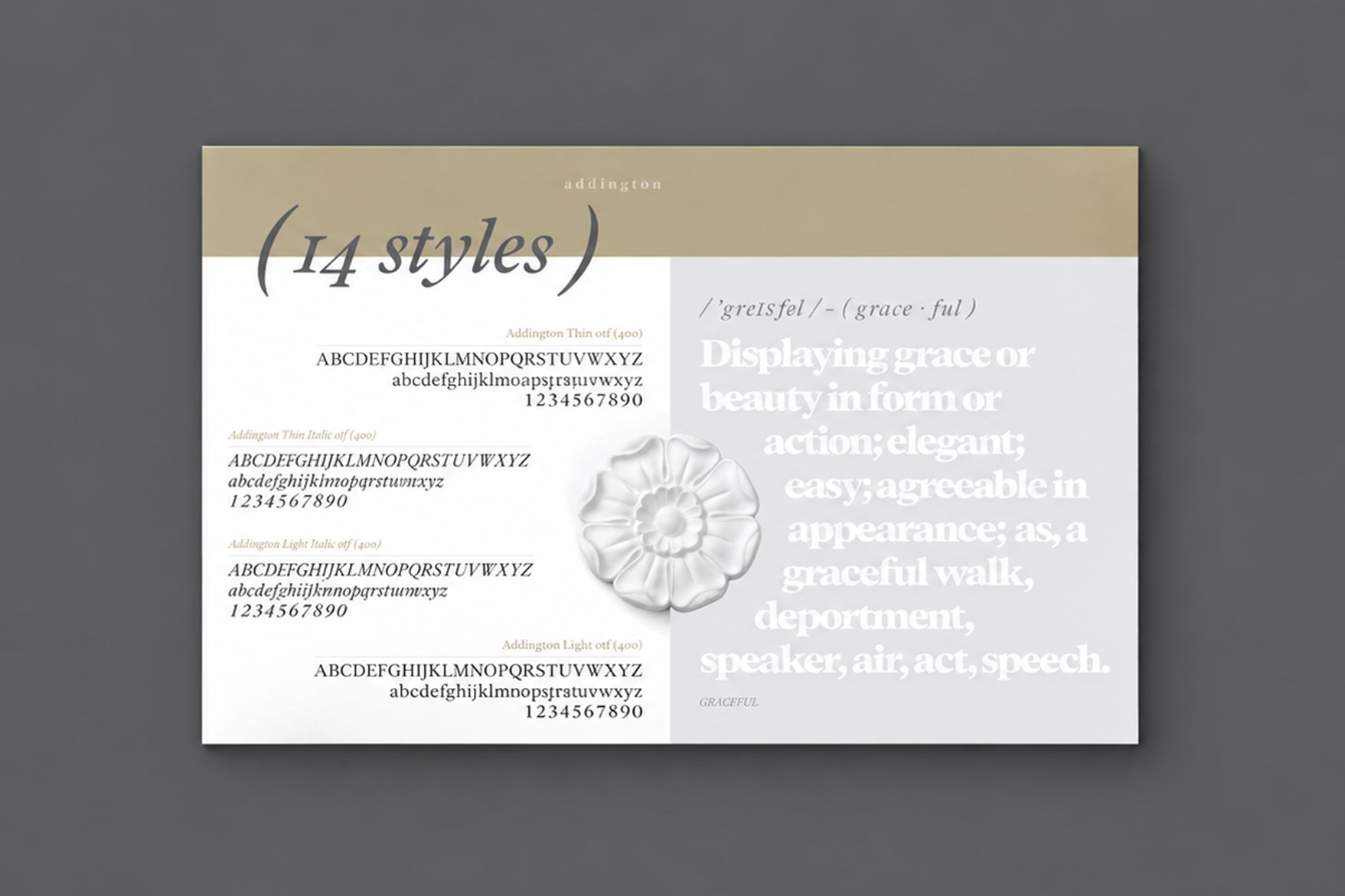
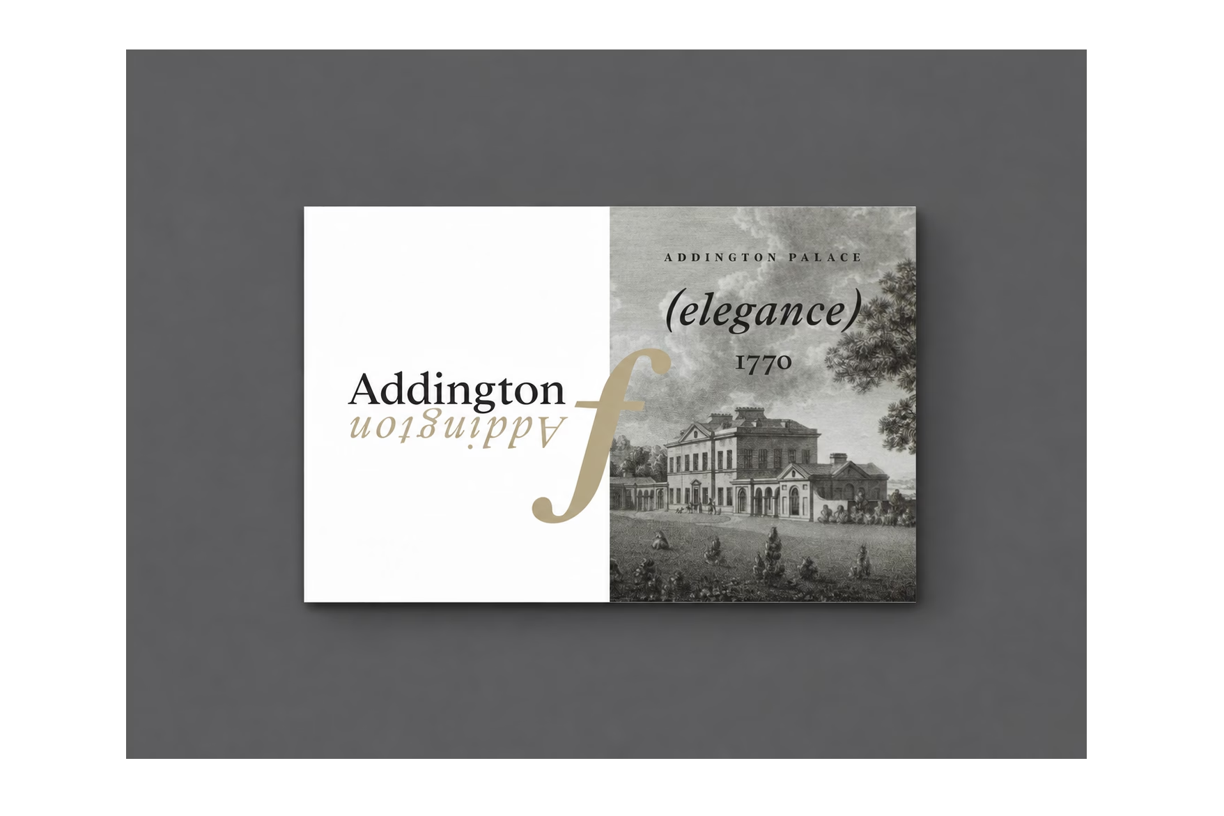
References to eighteenth-century paintings, book illustrations and historic architecture set the visual atmosphere. A restrained palette of grey, gold, black and white gives the pages cohesion without competing with the letterforms.
Headlines, running text and expressive compositions reveal different facets of the family. Scale, contrast and pacing guide the reading experience, allowing the typography to move between quiet detail and visual presence.
Let the letterforms lead.
Result
The booklet turns a type specimen into a visual narrative. It is an exploration of how the Addington family can be presented and experienced, not a commission to design the typeface itself.